
My Experience with Neumorphism Design: A Journey into the World of Soft UI
Join me on my journey as I explore the world of Neumorphism design and discover the benefits and challenges of this new UI trend.


Table of contents
Introduction
As a developer, I have always been fascinated by different UI trends that emerge every year. It's always interesting to see how designers and developers use new design concepts to create engaging user interfaces. One of the latest UI trends that caught my attention is Neumorphism Design, aka Soft UI
What is Neumorphism Design?
Neumorphism Design is a style that uses shadows and highlights to create three-dimensional effects on a user interface element. The style is inspired by Skeuomorphism, which is a design concept that involves making digital interfaces resemble their physical counterparts. However, unlike Skeuomorphism, Neumorphism Design focuses on creating soft and subtle shadows and highlights that give UI elements a rich, realistic and tactile feel.
Neumorphic Design Components
Neumorphic Design has three key components:
Subtle Shadows: A set of subtle dark and light shadows that are used to create the impression of an object floating above the surface. They're typically applied to the edges of the design to create a three-dimensional effect.
Rounded edges: Rounded edges are used to soften the appearance of the design and give it a more tactile and organic look and feel.
Soft gradients(optional): Soft gradients are typically used to create a soft, diffused transition between two colors, they can be used to give a more organic and natural look to the design, making it more pleasing to the eye.
What we'll be making
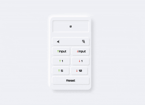
We'll be building a simple counter application that allows users to increment and decrement a value by different amounts. The body and buttons of the counter will be raised while the display will be recessed into the container. Differences in the heights of different elements will provide a clear separation between different elements
Creating HTML Structure
<!-- Create main container -->
<div class="container">
<!-- Display: Calculate value-->
<p>0</p>
<!-- Section: Groups all buttons (& input types) -->
<div id="section">
<!-- Section 0: Accept input from users -->
<div id="section0">
<input type="number" placeholder="Enter a number" id="input">
</div>
<!-- Section 1: Increment & decrement value by user input -->
<div id="section1">
<button id="increment"><span class="add">↑</span>input</button>
<button id="decrement"><span class="subtract">↓</span>input</button>
</div>
<!-- Section 2: Increment & decrement value by 1 -->
<div id="section2">
<button id="incrementByOne"><span class="add">↑</span>1</button>
<button id="decrementByOne"><span class="subtract">↓</span>1</button>
</div>
<!-- Section 3: Increment by 5, decrement value by 10 -->
<div id="section3">
<button id="incrementByFive"><span class="add">↑</span>5</button>
<button id="decrementByTen"><span class="subtract">↓</span>10</button>
</div>
<!-- Section 4: Reset value to 0 -->
<div id="section4">
<button id="reset">Reset</button>
</div>
</div>
</div>
Styling with CSS
Body
body {
  background: #f1f3f6;
}
This sets the background color of the entire page to a light grey color (#f1f3f6), which serves as the background color for the container.
Container
.container {
  background: #f1f3f6;
  border-radius: 1.5rem;
  box-shadow: 13.81px 13.81px 21px #D6D8DB, -13.81px -13.81px 21px #FFFFFF;
}
The container has a similar background color to the body, but it also has a border-radius of 1.5rem, which creates rounded corners. The box-shadow property creates the neumorphic effect by adding a light shadow on the top and left sides (-13.81px -13.81px 21px #FFFFFF) and a dark shadow on the bottom and right sides (13.81px 13.81px 21px #D6D8DB). This gives the container the appearance of being slightly raised off the page.
Display
p {
  background: #f1f3f6;
  border-radius: 0.5rem;
  box-shadow: inset 3.9px 3.9px 5px #DEE0E2, inset -3.9px -3.9px 5px #FFFFFF;
}
The display has a similar background color to the container and a border-radius of 0.5rem. The box-shadow property creates a neumorphic effect by adding a light shadow on the top and left sides (inset -3.9px -3.9px 5px #FFFFFF) and a dark shadow on the bottom and right sides (inset 3.9px 3.9px 5px #DEE0E2). inset gives the value display the appearance of being slightly recessed into the container.
Button & Input
button,
input {
    border: 1px solid #f1f3f6;
    background: #f1f3f6;
    border-radius: 0.5rem;
    box-shadow: 3.9px 3.9px 5px #DEE0E2, -3.9px -3.9px 5px #FFFFFF;
  }
The buttons and inputs have a background color that matches the container and value display. They also have a border-radius of 0.5rem and a border of 1px solid #f1f3f6. The box-shadow property creates a neumorphic effect by adding a dark shadow on the bottom and right sides (-3.9px -3.9px 5px #FFFFFF) and a light shadow on the top and left sides (3.9px 3.9px 5px #DEE0E2). This gives the buttons and inputs the appearance of being slightly raised off the page.
Button & Input Active State
button:active,
input[type="button"]:active {
    background: #f1f3f6;
    border-radius: 0.5rem;
    box-shadow: inset 2.5px 2.5px 8px #B2B4B6, inset -2.5px -4.5px 8px #FFFFFF;
}
The active state of button & input is set to the same color as the container and elements, which maintains the consistent look and feel of the design. The active state is set recessed to create the animation of buttons being pressed
Benefits of Building a Neumorphism Design
Better User Experience: Neumorphic designs can enhance the user experience by making it more intuitive and easier for users to interact with the interface
Simplified Design: Neumorphism focuses on creating a minimalistic and simplified design, which can help developers to focus on the essential elements of a UI and make it easier to build.
Faster Development: The use of simple shapes and soft shadows can help to create a minimalistic yet elegant design that requires less time to develop and maintain
Unique Design: Neumorphism is a relatively new trend, which means that incorporating it into a design can help it stand out from the crowd and make it look modern and fresh.
Challenges of Implementing Neumorphism Design
Finding the right balance between shadows and highlights: In Neumorphism design, the use of shadows and highlights is critical to achieving the desired effect. It can be challenging to find the right balance between these two elements to ensure that the design doesn't look too flat or too busy.
Accessibility concerns: One of the biggest challenges with Neumorphism design is ensuring that it meets accessibility standards. Because the design relies on subtle shadows and highlights, it can be difficult for people with visual impairments to distinguish between different elements on the interface.
Browser chrome: The default user interface of web browsers, also known as browser chrome, can sometimes clash with the neumorphic design. This can cause inconsistencies in the design language, making the UI look unprofessional and poorly designed.
Performance issues: Because Neumorphism design relies on heavy use of shadows and gradients, it can negatively impact the performance of the interface, especially on older devices or those with lower processing power.
Conclusion
In conclusion, neumorphism design is a fascinating and innovative UI trend that has gained popularity in recent times. It provides a unique visual experience by combining subtle shadows, soft gradients, and rounded edges to create a rich, realistic, and tactile feel. As we have seen in this article, creating a neumorphic interface is not very difficult, and with some CSS and HTML skills, anyone can create a simple neumorphic interface. However, it is important to note that this trend is not suitable for all applications and websites, and it is crucial to consider the context and user needs before implementing this design style. Overall, neumorphism design is a great addition to the world of UI design, and it will be exciting to see how it evolves in the coming years.
P.S. - As JavaScript doesn't directly contribute to the visual design of the counter application, I haven't discussed it in this blog post. However, if you're interested in exploring the full functionality of the completed project, you can find a link to it here.
Footnote: I welcome any feedback, comments, or corrections on this article. If you notice any errors or have suggestions for improvement, please feel free to reach out to me. Your insights are valuable and will help me to grow as a writer. Thank you!